


Colouring Inside the Lines
It is easy to overlook that fact that by 1933, when the first edition of Harry Beck’s famous diagram was presented to the public, Beck was able to draw on a full sixty years of earlier attempts to map London’s Underground. A key component in the success of Beck’s design was colour.
The individual line colours of London’s Underground have been far more stable than those of most metro or subway systems around the world, and I suspect there would be a public outcry if anyone suggested a change. We have Bakerloo Line brown, Northern Line black, the light blue of the Victoria Line contrasting with the Piccadilly Line’s deep blue, the silver of the Jubilee Line and the green and yellow of the District and Circle, all bisected by the pillar box red of the Central Line and the vivid pink of the Hammersmith and City. So whose bright idea was it? One might assume that the initiative came from the forerunners of London Transport, but actually (just like the name of the Bakerloo Line) the idea seems to have come from a London newspaper, the Evening News, in 1907.
Distinctive line colours enable passengers to negotiate the network, and not just on the map: they also appear at platform level, and in the fixtures and fittings inside carriages. There are examples of black and white tube maps, employing a complicated array of dots, dashes and cross hatching to differentiate between lines, but a splash of colour makes all the difference. What’s more, the idea of colour coding railway maps was nothing new. For example, John Airey was preparing coloured maps for the Railway Clearing House from 1867, soon after the first underground line opened in London.
Airey’s maps were coloured by hand (it would be another decade or so before colour-printed maps became commercially viable on a significant scale) but there was another reason why the earliest underground maps were resolutely monochrome, or at best triumphs of two or three colour printing. The whole point of today’s Underground map, with its colour coded lines, of equal thickness, is that it makes it easier to treat the network as a single entity, changing trains where necessary. The earliest London Underground companies were independent of one another. They had little interest in drumming up passenger traffic for their rivals. Perhaps that’s why the impetus for change came from an outside source, with no vested interests.
How can we be so sure the Evening News got there first? First, we need to establish the date of the earliest issue of the Evening News London Tube Map, and the sure fire way of doing that is through internal evidence, looking at how far the network had developed at the time the map was printed.
 The Evening News London "Tube Map", 1907
The first edition was published with red card covers, rather than buff ones, and with the title printed in blue rather than black in the top margin. The Charing Cross, Euston and Hampstead Railway (CCE&HR), otherwise known as the Hampstead Tube, had opened in June 1907; the extension to Strand station, opened in November 1907, is shown as under construction. Likewise, Edgware Road is open (so the map postdates June 1907) but the extension to Paddington is also under construction. The map was current in Summer and Autumn 1907.
 The Evening London News "Tube Map"; 2nd edition, c.1910
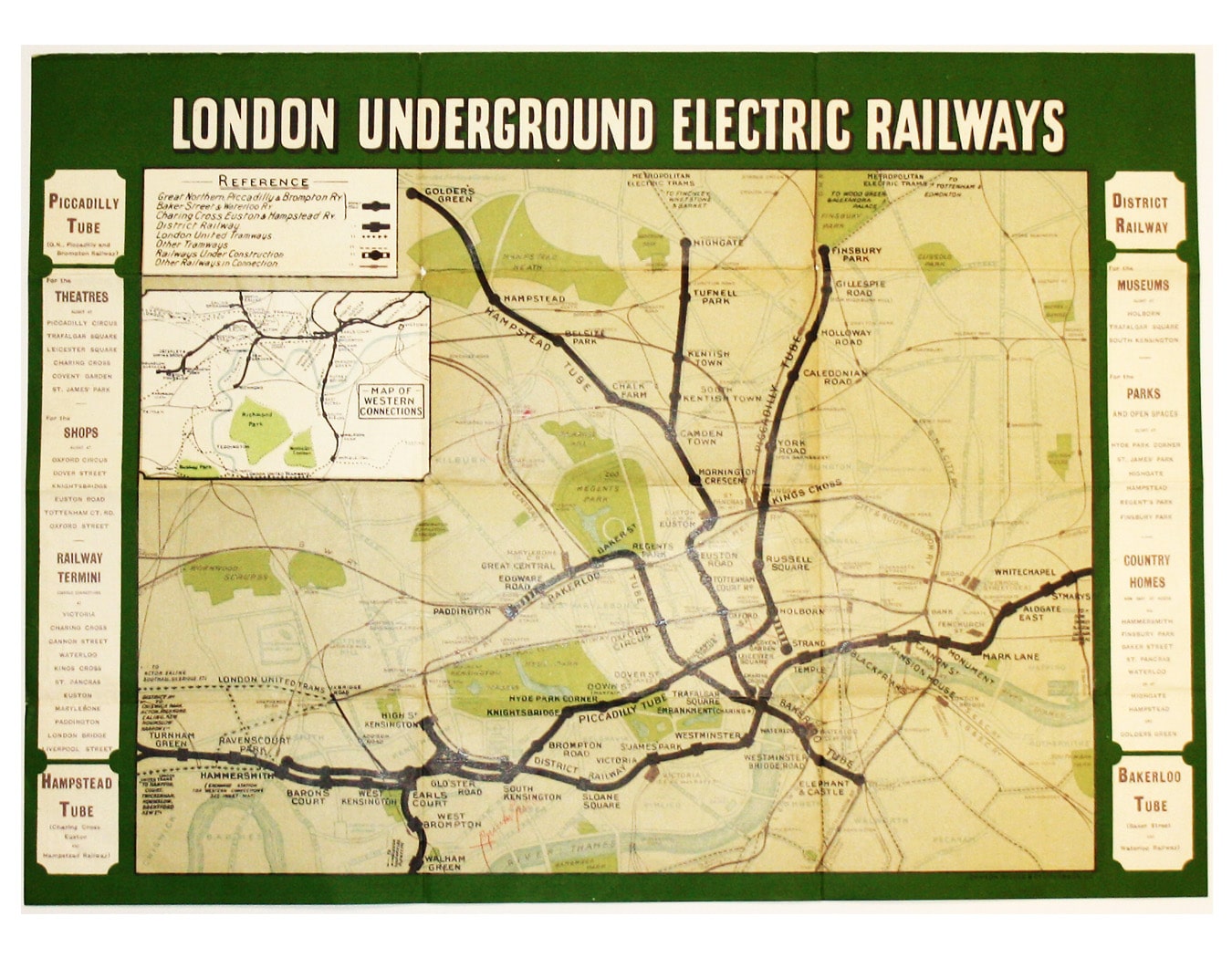 Underground Electric Railways Company of London
 The green border would become a distinctive feature of Edwardian UERL maps, but the Underground Group lines are represented in bold; colour coding on official maps was not introduced until the following year, 1908, when Waterlow and Sons also produced a striking postcard, with colour coded lines reversed from a black background.
 Central London Railway
 Not everyone got the message even then. The Central London Railway (CLR, the future Central Line, then an independent company) had been among the first to give maps away, in 1902. The CLR is shown in red, superimposed on a conventional street plan; all other lines are thin ribbons of black, barely legible.
 Central London Railway
 By 1911 the CLR had introduced elements from the latest UERL maps including a simplified surface topography and colour coded lines. However, they missed the point about making the map passenger friendly, for anyone changing trains. The CLR is three times the width of its neighbours, and all other lines are purely incidental.
View all available London underground maps
This blog was first published on a different platform. The original comments are reproduced below:
Peter B Lloyd:
Hi Tim,
Thanks for this bold contribution to these murky recesses of cartographic history!
You’ve certainly made a convincing case that the ES 1907 map was the first map of London’s Underground to show colour-coded routes.
What I’m not seeing is the smoking gun that proves that ES’s own guys designed this map.
As you note, the mapmaker at the Central Railway kept on with a company-centric map despite the invention of the color-coding design.And, as I’m sure you know, the Metropolitan Railway kept up with the same company-centric style in their maps throughout the 1920s. Cf the Met’s useless pocket card map for the 1924 British Empire Exhibition. What this suggests to me is that UERL had its own draughting office that was diligently churning out colour-coded maps from 1908 to 1933 while the narrow-minded backwoodsmen in the draughting offices of individual railway companies stuck to their single-colour maps. How else can one explain the parallel series of maps – colour-coded and non-colour-coded?
But, if the putative UERL office was doing this from 1908 to 1933, then by Ockham’s razor shouldn’t we suppose it was also responsible for the 1907 ES map?
To be sure this 1907 map was branded by the ES, but maybe they just commissioned UERL to design the map for them? After 1907 there is AFAIK no subsequent series of ES Underground maps. Nor did they have a map before this. So …they built up this expertise in secret and used it to produce a one-off map?
My suggestion is that Ockham’s razor relieves us of this complex hypothesis and leaves us with the simple theory that some bright spark at UERL came up with the idea and developed it, and later Stingemore and Gill and Perman (and later Beck) inherited it.
Still no smoking gun, obviously, but the smoke seems to be wafting from the UERL not the ES.
How to explain the continued Johnson Riddle monochrome maps? Maybe UERL had a long contract with them?
Peter
Tim Bryars:
Thanks Peter, in the Edwardian period we’re still in an era of anonymous draughtsmen, with very little to guide us except the evidence we can wring from the maps themselves, so almost anything is possible and your suggestions are entirely reasonable. What we can say with some certainty is that the first colour coded map was published by the Evening News rather than being an official UERL publication, and everything goes from there.
As to who came up with the idea, I think we have to look at the printers and publishers involved in the earliest UERL maps. The UERL used three distinct designs within months, which suggests they weren’t especially happy with any of them, ditching Waterlow and Sons in favour of Johnson Riddle and Co, and staying with them through the transition from monochrome to colour. However, the Evening News hired George Philip and Sons, who were at no point in this period an official printer to the UERL. I strongly suspect that the UERL’s design brief was fairly sketchy (you mention a ‘putative’ UERL draughting office) and relied upon significant input from the printer, hence the very different designs which different printers produced. George Philip and Sons was a well established cartographic publishing house which was perfectly capable of generating an original design.
So if I had to guess, on the basis of what we know, I’d say that the UERL was aware that its designs weren’t quite cutting the mustard and seized thankfully on a design which had passed through the hands of an excellent map-maker. That seems like the simplest explanation. With a business hat on, that makes more sense to me than the UERL supplying or testing a new design via a newspaper, with no hint of UERL branding or association. I’m not sure what would be in it for the newspaper either. They were selling the maps for a penny each, presumably on the basis that there was nothing better out there. While not a series, exactly, it wasn’t a one off either. There are at least two versions of the Evening News map, and they seem to have appeared over two or three years (at least). Perhaps the new, improved UERL colour coded maps made them redundant.
No disagreements from me about some of the oddities produced by the independent railway companies! The Met in particular had to be dragged kicking and screaming into the LPTB. I think someone once told me that they ditched a lot of their archive rather than hand it over in 1933.
One thing I do need to do, when I have time, is to trawl through back issues of the Evening News to see if they had anything to say about the launch of their map. All might yet be revealed…
Leave a comment