


The Edwardian origins of the tri-fold tube map: fit for the waistcoat pocket
At the entrance of any modern Tube station are racks of passenger maps, free for anyone who needs one. The familiar format is very practical. Each map folds out to reveal three panels. It fits easily into the pocket and can be unfolded, even at platform level, without being carried away by a sudden gust of air, and without the user jabbing his neighbour in the ribs during rush hour. Small wonder that this has been the standard format since Fred Stingemore’s series of maps of the network were introduced in 1925. There were a couple of false starts, and we are left with the usual questions of who devised the format and when. I’m going to propose David Allen and Sons, in 1909.
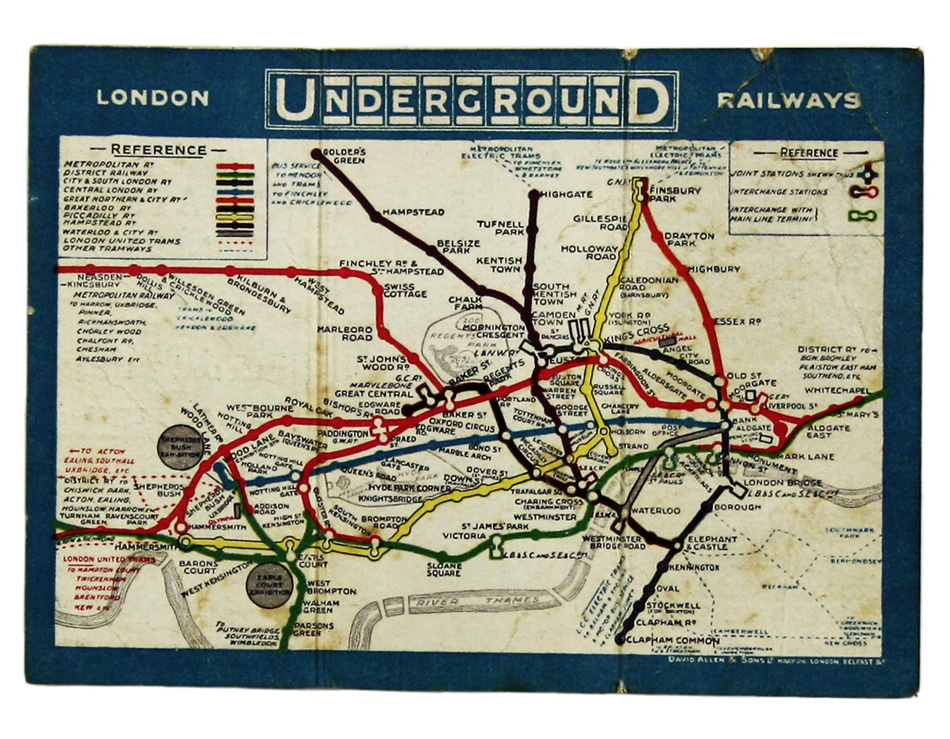
David Allen & Sons was a general printers established in Belfast in the mid 19th century. They are not known as makers of Underground maps – this seems to be their only one – but they are known for their posters, including some very striking WW1 recruiting posters. I read recently in Ben Macintyre’s ‘A Spy Among Friends’ that Kim Philby was tasked with ghost writing the centenary history of the firm for William Allen, ‘a very boring book about printing, ink and paper’. I checked, and unfortunately Philby/Allen makes no mention of our map. However, if you’ve read my recent posts about the ‘Evening News’, George Philip & Son and the introduction of colour to the London tube map, you’ll have some idea of how influential individual printing firms were in the design of pre WW1 Underground maps, before design was brought firmly in-house by the Underground Group in the 1920s. David Allen & Sons might quite easily have originated the three panel format and approached the UERL with the idea. Such an original proposal would explain why this appears to be the firm’s first foray into printing pocket tube maps (although the London Transport Museum holds a number of posters the company printed for the Underground Group and its predecessors). A lukewarm response to the map would also explain why it remained David Allen’s only tube map for twenty years.

The map has traditionally been dated to circa 1911, for example by Leboff and Demuth (‘No Need to Ask’, p. 56). The example we currently have in stock is unusual as it was issued by the Metropolitan Railway, which was not part of the Underground Group. The cover is therefore a variant, advertising the opening of Dollis Hill Station - which took place in October 1909. It seems reasonable to assume that a station would only have been advertised as ‘new’ for six months or so, giving us a date of late 1909 or early 1910. A year or so won’t transform our understanding of the evolution of the London Underground map, but it’s worth noting.
At 11 x 15 cm David Allen’s map is amongst the smallest ever issued to passengers. It may have fitted perfectly into an Edwardian waistcoat pocket but, with the best will in the world, it’s difficult to read. Similar problems affected MacDonald Gill’s tri-fold map of 1921, and the Met’s British Empire Exhibition Map of 1924.


Fred Stingemore’s maps were a fraction larger (12.5 x 15 cm, soon increased to 14.2 x 16,6 cm). Even then, it was sometimes necessary to use arrows to link names to stations, but the format was viable. Most were printed by Waterlow and Sons, but the Underground Group commissioned David Allen to print the last issues before the introduction of Beck's diagram.

David Allen & Sons may not have got it quite right first time, but they were onto a winner. The huge and unwieldy District Railway maps, mostly approximately 65 x 105 cms (also mounted on linen and sold, rather than given away) had just given way to free paper maps, typically folding into eight panels. With the right design, tri-fold maps were a logical step forward.
Our friend Einar Frigland writes to let us know:
"A very interesting map, this one! I have a copy, and the map side is like the one you write about. I certainly agree with you that when they wrote about Dollis Hill being “new”, they probably also meant it!
There is another interesting thing about the map: Bishopsgate is here called by its current name, Liverpool Street. That change took place in November 1909, I think. So it should be safe to date the map “not before November 1909”? The end date is more open, but Stamford Brook is not in the map, so before February 1912, at least. Other clues?? I don`t know.
There is also another, earlier version of the Allen map; have you seen it? The border of that one is light blue. It does NOT mention Dollis Hill, so it is from before October 1909. Liverpool Street is called Bishopsgate. I do not know when it was printed, but since the White City exhibition area is called Shepherds Bush and not Franco-British Exhibition, I assume it is from after October 1908; 31/10 1908 being the last day of the F-B Exhib. So it was used for less than 1 year.
One more thing:
David Allen & Sons actually contributed more to the Underground maps than these first card issues: The last 4 of Stingemore`s Card maps, SC9 through SC12, were printed by the same firm. (At least that is what it says on my copies!) Philby definitely ought to have mentioned the company in connection with underground maps!"
Update <23/09/16>
The number of states of this map keeps on rising, which is very encouraging. Following on from Einar’s comment, my friend Winfrid de Munck has written with details of these ‘nifty, very-much-ahead-of-their-time, tri-fold maps’ in his own collection. Both were issued by the Central London Railway and both refer to Bishopsgate rather than Liverpool Street (so both are pre-November 1909), but one has a dark blue border and the other’s is light blue. Here they are:


So we can now confidently assert that there are at least three states of the map itself (leaving aside the covers) produced before and after the renaming of Liverpool Street, which suggests that it had a longer life span that one might have thought.
Photographs reproduced by kind permission of Winfrid de Munck
Update <25/05/19>
We’ve just purchased another variant of the map from a collector in the US. The Central London Railway extension from Bank to its new terminus at Liverpool Street is shown as under construction, so the period between July 1910 and July 1912 is the likely window for the printing of this edition. The overprint is for the Edgware Road branch of Gardiner’s department store, which was on the corner with Chapel Street. Gardiner’s was known as ‘the Harrod’s of the East’ with its flagship store in Whitechapel.
This blog was first published on a different platform. The original comments are reproduced below:
Mike Lavan:
Cracking read as ever, thanks Tim! I have the light blue bordered one in my collection, though unfortunately the other side of the map is very faded and the vertical “UndergrounD” logo is the only thing I can make out.
Tim Bryars:
Cheers Mike, this is one of those maps where more and more variants turn up the more one looks. I think it used to be thought of a a short-lived, failed, experiment, but the format was evidently received favourably enough to be revised, updated and circulated over at least two or three years – and circulated by the Met as well as the UERL. The fact that so many surviving examples are heavily worn suggests that the public found them useful, and carried them about. It’s relatively hard to find today, but I think that is due to a low survival rate rather than short production runs over a limited time.


Leave a comment