


Sydney and the origins of 'Becksploitation'
Astute commentators have already noted that the 1939 Sydney Underground map is “strikingly similar” to Beck’s diagrammatic Tube map (see, for example, Claire Dobbin in London Underground Maps). It has even been suggested that this is the first straight copy of Beck’s work. Here it is:
 You’ll see why I’ve had a bit of fun with it in the past, putting it in a London shop window and letting passers by scratch their heads and try and work out how it fits with the current Tube network. And of course, even though some of the names (such as Richmond and Camden) are the same, it doesn’t. Even the cover, with its bar and roundel logo, setting of the text and coverage of the central area, is a pretty much a direct copy of the Beck passenger maps issued by London Transport 1933-38.
 The curious thing is that Sydney decided to celebrate Beck a matter of months after London Transport dropped his services in favour of work by Hans Schleger, a Jewish refugee from Nazi Germany and a hugely influential pioneer of corporate design, who worked under the pen name ‘Zero’. (The best survey of his work was written by his wife, Pat Schleger: Zero: Hans Schleger, A Life of Design. Lund Humphries 2001.) Schleger updated the diagram between 1938 and 1941, when Beck was permitted to resume his work (that is, until LT stopped answering his letters, circa 1960).
 The covers show how much changed between the Beck and Schleger issues of 1938, and here’s the Sydney map in context. It’s the one lying on top, by the way.
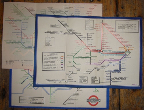 As you can see, it has a great deal in common with the 1938 Beck at the foot of the photo, while Schleger’s airbrushed Art Deco design at the top is a very different beast.
It’s proving surprisingly difficult to find detailed information about the Sydney map. Answers on a postcard, please! Here’s what I currently have:
Sydney Suburban and City Underground Railway Map, No. 1 1939. Sydney, Waite & Bull for the Commissioner for Railways, New South Wales.
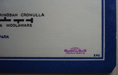
16.5 x 24.5 cms. A printer’s job number, bottom left, but the initials E.P.C., bottom right, adjacent to the name of the printer, may be the draughtsman.
This, I think, is the job number:
As you can see, it has a great deal in common with the 1938 Beck at the foot of the photo, while Schleger’s airbrushed Art Deco design at the top is a very different beast.
It’s proving surprisingly difficult to find detailed information about the Sydney map. Answers on a postcard, please! Here’s what I currently have:
Sydney Suburban and City Underground Railway Map, No. 1 1939. Sydney, Waite & Bull for the Commissioner for Railways, New South Wales.
16.5 x 24.5 cms. A printer’s job number, bottom left, but the initials E.P.C., bottom right, adjacent to the name of the printer, may be the draughtsman.
This, I think, is the job number:
 And this may well be our semi-anonymous draughtsman, next to the logo of commercial printer Waite and Bull:
 So, things which puzzle me. The Sydney Underground goes back to the 1920s. I’ve seen later diagrammatic maps, but nothing before or after which is quite so clearly inspired by Beck. Why was there no No. 2 1939? Or even, No.1 1940? Perhaps the design proved unpopular with Sydney commuters, or maybe LT had a sense of humour failure and threatened to sue, even though they had just dropped Beck’s design (if not the concept) themselves… And who is EPC? Did he make any other maps?
The real interest here, of course, is how other cities have tackled the problem faced by London since 1863 – how best to map the railways beneath one’s feet.
So, things which puzzle me. The Sydney Underground goes back to the 1920s. I’ve seen later diagrammatic maps, but nothing before or after which is quite so clearly inspired by Beck. Why was there no No. 2 1939? Or even, No.1 1940? Perhaps the design proved unpopular with Sydney commuters, or maybe LT had a sense of humour failure and threatened to sue, even though they had just dropped Beck’s design (if not the concept) themselves… And who is EPC? Did he make any other maps?
The real interest here, of course, is how other cities have tackled the problem faced by London since 1863 – how best to map the railways beneath one’s feet.
You’ll see why I’ve had a bit of fun with it in the past, putting it in a London shop window and letting passers by scratch their heads and try and work out how it fits with the current Tube network. And of course, even though some of the names (such as Richmond and Camden) are the same, it doesn’t. Even the cover, with its bar and roundel logo, setting of the text and coverage of the central area, is a pretty much a direct copy of the Beck passenger maps issued by London Transport 1933-38.
The curious thing is that Sydney decided to celebrate Beck a matter of months after London Transport dropped his services in favour of work by Hans Schleger, a Jewish refugee from Nazi Germany and a hugely influential pioneer of corporate design, who worked under the pen name ‘Zero’. (The best survey of his work was written by his wife, Pat Schleger: Zero: Hans Schleger, A Life of Design. Lund Humphries 2001.) Schleger updated the diagram between 1938 and 1941, when Beck was permitted to resume his work (that is, until LT stopped answering his letters, circa 1960).
The covers show how much changed between the Beck and Schleger issues of 1938, and here’s the Sydney map in context. It’s the one lying on top, by the way.
As you can see, it has a great deal in common with the 1938 Beck at the foot of the photo, while Schleger’s airbrushed Art Deco design at the top is a very different beast.
It’s proving surprisingly difficult to find detailed information about the Sydney map. Answers on a postcard, please! Here’s what I currently have:
Sydney Suburban and City Underground Railway Map, No. 1 1939. Sydney, Waite & Bull for the Commissioner for Railways, New South Wales.
16.5 x 24.5 cms. A printer’s job number, bottom left, but the initials E.P.C., bottom right, adjacent to the name of the printer, may be the draughtsman.
This, I think, is the job number:
And this may well be our semi-anonymous draughtsman, next to the logo of commercial printer Waite and Bull:
Leave a comment