

Deep Purple: Bryars & Bryars Ride the Elizabeth Line
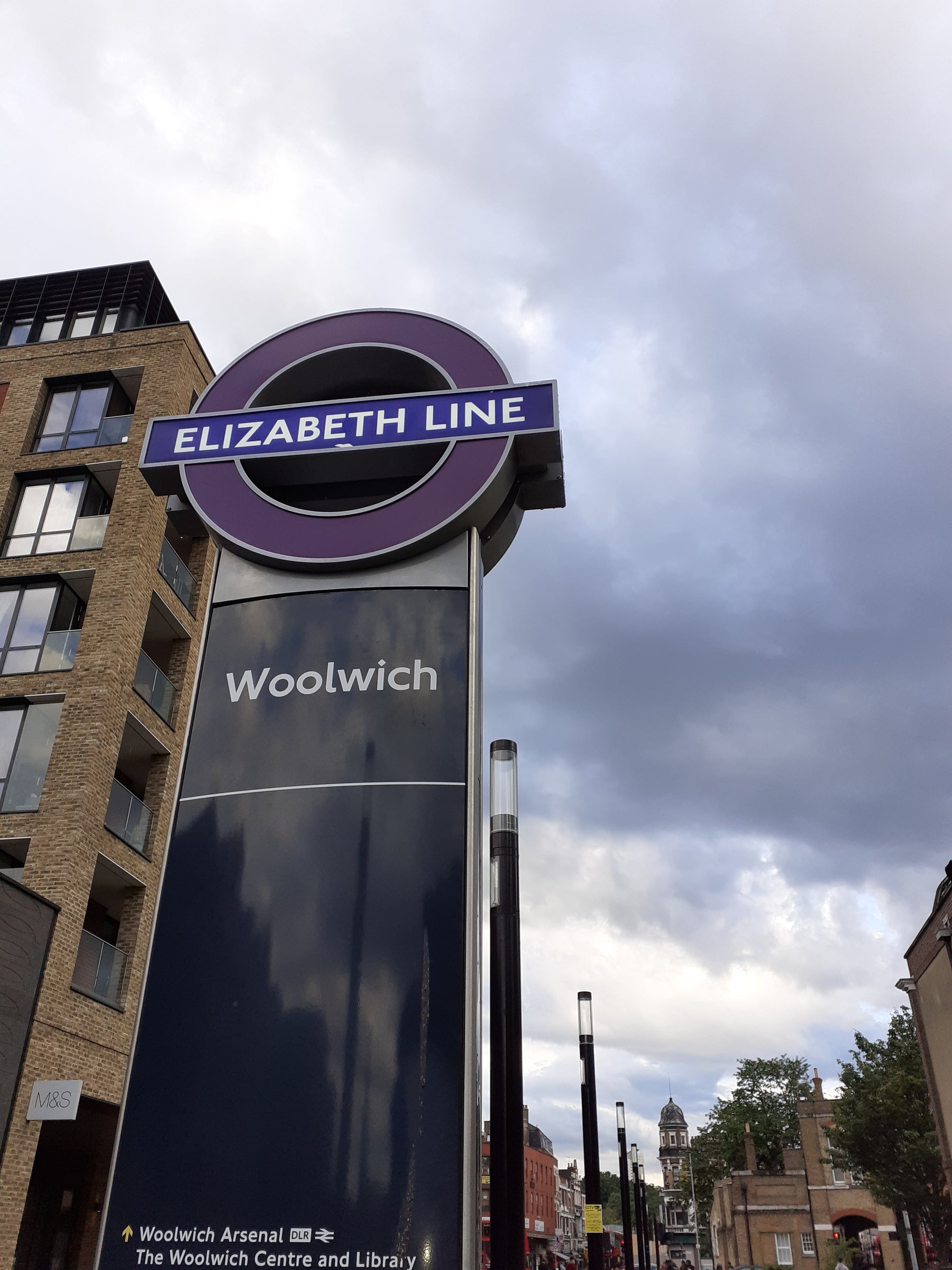
Too soon after dawn on Tuesday, May 24th 2022 I was queuing in the drizzle with a couple of hundred other excited people to get on the first fare-paying Elizabeth Line service from Woolwich to Paddington, due at 6.33 am. Momentous stuff. A friend said she saw me on the BBC News at Ten that night, recorded for posterity in a tracking shot along the length of the carriage. Apparently I was looking pale and haunted, but I hadn't had my breakfast. I'm not at my best before the first coffee of the day, but I can assure you all that I was positively buzzing with elation.

One could start again with a new design. New maps by Doug Rose and Maxwell Roberts spring instantly to mind, and there are many others. But before we get there, there are three very basic things to consider. First, do we still need a printed map at all? From me, that's an emphatic yes. It's partly a matter of tradition and pride in the network, but I also believe that the rush towards a cashless, paperless society is ill conceived: not everyone has access to smartphones and they don't work in all situations.
We risk excluding older, poorer or disadvantaged individuals. In my more cynical moments I wonder if the map is being run down prior to phasing it out, but let's say TfL would like to keep it going. In which case, to make the map readable again, it either needs to be bigger or some stuff has to go. Sometimes, in the interests of clarity, less is more.
Bear in mind that the three panels of the modern passenger map (ignoring the unsightly additional text panel to the right) are exactly the same dimensions as the tri-fold editions of Beck's diagram published in the 1930s. There's just twice as much stuff in the same space:

Does it all need to be there? Current thinking seems to be to show all TfL services other than buses, but what does the end user need? A Londoner planning a new commute, a trip to the dentist or a pub lunch with friends in an unfamiliar part of town probably has different requirements from someone on holiday. In the late 1920s, the Underground Group had a simple solution — two maps:


Fred Stingemore's successful series of tri-fold maps were issued between 1925 and 1932. They were extremely simple: other than the Thames (which Stingemore re-introduced as a point of reference in 1927) there are colour-coded Underground lines, with no distractions.
Edgar Perman's much larger folding map promoted the idea of using the Underground for leisure travel. It shows parks, public buildings and places of interest. Horses for courses.
I can appreciate the desire to show an integrated transport network (there have been various attempts to issue joint bus and Tube maps for over a century) but if we're going to include everything from the Croydon Tramlink to the Emirates cable car, we're going to need a bigger map.
If I were to suggest a format, the green bordered 'common design' maps issued by the UERL circa 1911 could be ideal. Not too big to unfold on a platform, but perhaps big enough to allow a good designer to do something about the incomprehensible interchanges, and perhaps to make the fare zones legible but less intrusive. At the moment the large numerals are out of proportion to everything else and very distracting. Useful information, but the eye doesn't know where to look.

One of the things which is very much in the tradition of earlier Underground mapping is the Ikea sponsorship. The micro-chip sized Ikea logo advertising their Hammersmith store is as difficult to read as the rest of it, but isn't out of place. Official Underground maps overprinted with the locations of businesses, large and small, were quite common between the Edwardian era and the 1930s.

Another feature of the Edwardian Tube which we could revive is the design competition. In 1907 the UERL ran a public competition to find a new logo. The winning design was by one WJ Pawsey, 'employed in the showcard department of Imperial Tobacco'. It's worth remembering that all of the named, individual designers of the London Underground diagram - HC Beck, Harold Hutchsion, Paul Garbutt - produced their original designs in their spare time. None had been employed to devise a new map.
Perhaps it's time for TfL to take a chance on a radically fresh design which is the brainchild of a single individual. That's how the Underground has achieved its greatest design successes. I hope that one day, soon, we'll see a new map with the same, diffident announcement which was printed on the cover of the first edition of Beck's diagram: 'A new design for an old map. We should welcome your comments'.

— Tim
****
When Tim got back all excited and happy from his first journeys on the Elizabeth line I asked him what the moquette was like (if you wish to cultivate a reputation for intelligence and sympathy you must learn to put these sorts of questions). These were his wordless answer:

Having declined Tim's invitation to join him and the rest of the city's nerds on the Elizabeth line's inaugural passenger journey, I decided later that week to abandon a well-trodden route to an urgent appointment and treat myself to a London transport classic — the reckless dash across town. Would the Elizabeth line bear comparison to her Underground sisters, or was she just a railway in tube's clothing?
I did not consult any timetables or maps before setting out, which is my right as a Londoner and my privilege as a solid Level 8 Underground user. Level 8s are characterised by canny platform placement and excellent interchange instincts even on unfamiliar journeys (avoiding, wherever possible, the inefficiency of changing from a deep modern line to an early cut and cover. Westminster station is the exception — it's worth changing from the Jubilee line onto the Circle or District just for the fun of the aesthetic transformation. Bladerunner to Bertie Wooster in two escalators). A Level 8 may have occasional recourse to the TfL journey planner, if only to argue with it. A Level 9 is a more confident and better-travelled 8, and they are never caught off guard by how low and hard the Central line seats are. Level 10 many only be achieved through long immersion in the deep and secret lore of the tunnels. Tim is a 10.
Of course I was hampered by questions from pleasure tourists, which is where purposeful striding gets you. An Elizabeth line catechism will develop in time ("Does this train— " "You'll need to change at Liverpool Street"), but that morning I wasted precious seconds listening to whole sentences before answering.
The number of school parties on the platforms ought to have been surprising — one doesn't usually account for dodging great crocodiles of them outside the more museum-infested parts of London — but I know a cheap geography field trip when I see it. Still, the Elizabeth line platforms are wide enough to bowl right past without fear of scattering children in one's wake.
Not pausing to look for the design elements which are said to be local and meaningful to each station, I admired the broad, bland sweep of the tunnels. The Elizabeth line's airy anonymity will probably age much better than the futuristic Jubilee line or the dystopian DLR.
I had nothing to read on my journey, having left the house in a careless hurry without my book and expecting wifi in my entitled millennial way, so I was forced to make my own entertainment out of the materials to hand. Unfortunately these were Transport for London's anti-sexual harassment posters, so I amused myself by imagining lyrics to an unpopular and inappropriate Marvin Gaye B-side:

Sexual Staring
The interchange onto the Central line at Tottenham Court Road is seamless but very long, and so I wasn't able to check out the newly issued station wall maps in situ while rushing by. One further change onto a different Underground line and I emerged at my destination with two minutes to complete a three minute walk. I arrived slightly out of breath but not fighting for my life, blessing the Elizabeth line for getting me most of the way here in air conditioned comfort. She may not be an official tube line, but she's got an Underground soul.
I'm enough of a trainspotter-by-proxy to have detoured via Paddington on my return journey to ride the line as far as I could for fun, at terrific speed and without let or hindrance (which, in true Underground style, only happens when you have no particular place to be).
Looking at the maps later on the TfL website, from a traveller's perspective informed by what we do at Bryars & Bryars and how eloquently Tim has written about the design phenomenon of the Underground diagram, was... upsetting.
It's worth noting that there are two separate network maps, one that includes all the railways serving the London termini (Tube and Rail) and one that excludes all of them except for Thameslink (Tube). The Tube & Rail map (which is the one displayed by default under the Maps tab of the website) uses solid purple for the Elizabeth line while the Tube map uses parallel lines, consistent with how the DLR is represented. It's interestingly reminiscent of the unhelpful and un-unified maps of old, which is cold comfort to the normal passenger who doesn't give a toss about operational rivalries (or transport mapping exegesis) and just wants a clear way of getting from A to B.
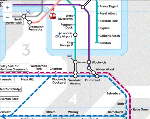
I won't touch on the station configuration as I know it's not meant to reflect above-ground reality, but the situation at Woolwich is misleading to say the least:

Some of the confusion is just carelessness — the interchange ring at Old Street makes it look like part of Elizabeth line at first glance, and a glance is often all you have time for on a crowded train or busy platform:

This unholy mess around Edgware Road and Paddington that I first saw on a carriage panel map was almost enough to make me doubt myself. If I didn't already know what I was doing I should've had to stare hard enough to get reported to the pervert police:

If the future of the diagram is a half-baked app like every other bloody thing (why no zones or fare finder on TfL Go?), there is at least scope for some useful innovation. Its step-free mode indicates which platforms and trains can be accessed without using stairs, and cleverly simplifies the diagram to remove inaccessible stations and interchange rings where step-free access to a line is not possible from that station:


How truly inclusive and accessible a smartphone-only map can be is, as Tim rightly points out, a matter that deserves much greater consideration than it gets in the bureaucratic rush to insist that digital is always better than tangible.
— Pinda
Leave a comment